
Busy Charts = Headache
Someone sent me a headache inducing chart recently (I've blurred the schools):
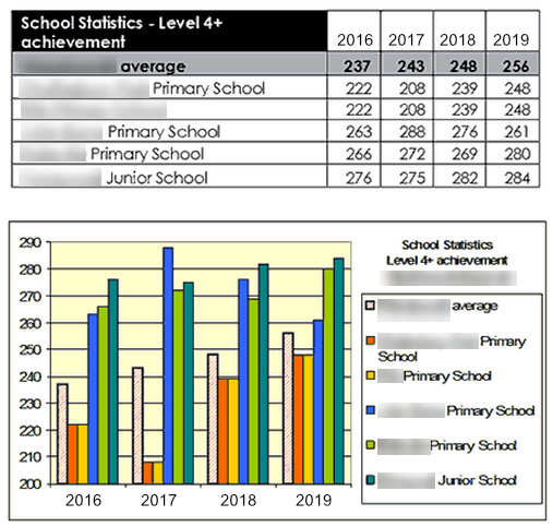
A data table and a chart - double the fun.
The table is OK (ish) and is readable – but the graph. Genuinely I can’t get my head round what is going on.
- 6 data sets, represented by colours and shading
- Horizontal gridlines
I'm going to guess that the chart authors were trying to show many things on one chart, and used the only way they knew in Excel. I am guessing that this chart is meant to show:
- The progress for individual schools 2016 to 2019
- The comparison between schools for each year
- The comparison between schools over the years 2016-2019
- The comparison between schools and LA average
Far too busy, and cognitively demanding to try and make sense of everything that is going on. The information density is just to too high for this type of chart.
Some Excel-fu later and we have what is called a panel chart:
(1) Reduced / removed the use of colour
(2) Reduced the information density (of each "panel")
(3) Removed grid lines
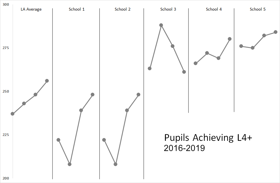
This chart allows me to see:
- That the trend for all schools (except 3) is upwards
- Schools 3, 4 and 5 are above LA average
- Schools 1 and 2 are below LA average – but are on an upwards trend
- School 3 has for 3 consecutive years dropped in performance
- Schools 1 and 2 have improved faster than schools 4 and 5 (the graphs are steeper)