
Perception is reality
One of my previous head teachers taught me a phrase – “Perception is reality” – used for many aims; to spur us on during Inspection, to praise when initiatives went well and to feedback when things went wrong.
This is equally true for data. Certain “perceptions” seem to be universal. Things like “bigger is better” and time moves from left to right (in Western society).
Look at this graph that seems to mess with perception:
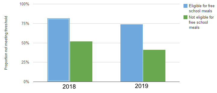
To most readers, "bigger is better”, so at first glance at this chart, it shows something going down from 2018 to 2019 – hence I perceive that results have gone down. Not true!
The Y-axis is actually displaying a negative – the percentage NOT achieving 5 A*-C (or equivalent) – so on closer inspection from 2018 to 2019 those NOT achieving has dropped, hence the performance has actually risen. Even though my chart is showing a drop.
Confusing.
After some Excel-fu, and stripping thing right back to the style of graphic seen in newspapers / broadcast media:
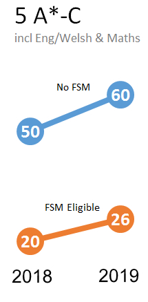
Instead, here I am plotting actual attainment – those achieving 5 A*-C grades. Also, swapping from a bar chart to a line graph allows me to make a much more compact and easy to read statement for comparison.
The reader can see that both have risen by about the same AND that FSM achieve less than half of non FSM.
Call to action
Don’t plot negatives – people see bigger as better.