
Visualisation fail - schools as stacked series?
Sometimes you see a chart on a website and can't help thinking about the motivation and thought process behind it. Take this, taken from a live school local authority web site:
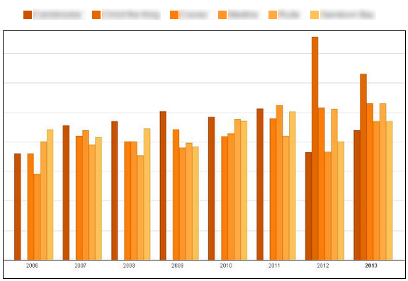
The colours haven't been adjusted - shades of yellow / orange representing something over the years 2006 to 2013. No idea what the y-axis shows and no title to help me.
Oh, and a bonus that on most of the years, one of the columns is missing.
The "main" issue, ignoring the fact that the reader just can't "see" whats going on due to the colour choices and no axis information, is that the x-axis is the years, and the series are schools. To compare year-on-year trends, the reader is expected to isolate a shade of orange and track it across the years -- almost impossible.
From the data elsewhere on the website, we find that this is the 5A*-C data for six schools.
Some Excel-fu later:
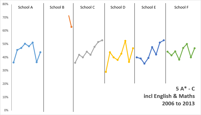
Here, we can easily identify the progress being made in schools C and E - whilst School F appears to make little progress over the same period.
Call to action
- Proof read your charts, and ask yourself "do the colours we've used make things harder to read"
- When comparing multiple series (schools) over time - don't put time on a common x-axis -- people can't extract the data -- use a panel chart.
- Remember to label the axes and title the chart - or people have no idea what it's showing.